Millie Chan

Summary
Client
WAR ROOM
Vancouver, BC, CAN
Duration
June 2024 - June 2025
Services
User Flows
User Experience Design
User Interface Design
Site map
Low-fidelity wireframes
High-fidelity prototypes
Design system and UI kit
Usability tests and findings
Mission
To empower War Room’s clients with a transparent, real-time advertising experience through a centralized app—Kedet—that enhances communication, simplifies ad campaign onboarding, and visualizes ad performance data. Internally, the app streamlines workflows for account managers and campaign teams, minimizing manual touchpoints and improving setup efficiency.
My Contributions
As the lead Product Designer, I shaped the Kedet App from concept to prototype—conducting discovery sessions, mapping the ad campaign setup workflow, and designing a real-time performance dashboard for clients.
I collaborated closely with developers, project managers, campaign managers, and leadership to align business goals with user needs, led iterative feedback loops with internal users and clients, and built a scalable design system to ensure consistency and streamline development.
Impact
Both the initial launch and further iterations produced great results:
in manual onboarding tasks for account managers
in client satisfaction due to real-time data visibility
faster campaign setup time compared to the previous
Through interviews and process shadowing, we uncovered two critical pain points:
Client-Side Gap
Lack of real-time visibility for clients into how their campaigns were performing, leading to frequent, repetitive requests to account managers for updates.
Internal Bottleneck
Fragmented internal workflow, where account and campaign managers juggled multiple tools and documents to coordinate ad setup with clients, often resulting in misalignment or delays.
Vision
To build a client-facing and internally functional app that bridges transparency and efficiency in programmatic advertising workflows.
Proposed solutions
Client Dashboard
A clean, intuitive interface for clients to track ad performance in real-time and chat with their account manager
Ad Campaign Setup & Performance Creative Module
An internal-facing feature set for account managers to streamline onboarding, manage creative approvals, and oversee campaign launch readiness
The Process - Step 2
Understand the Users
To define the core problems, I conducted 1:1 interviews with account managers, campaign managers, project managers, and clients, while also shadowing internal teams during live onboarding sessions. I audited existing tools like spreadsheets and email chains, mapped the full campaign lifecycle from both client and internal perspectives, and analyzed recurring support tickets and feedback. This comprehensive approach revealed critical gaps in client visibility and internal workflow efficiency, which shaped the foundation of the Kedet App.
Client-Side Gaps
1 /
No centralized place for clients to view live campaign data (e.g., spend, ROAS, CTR)
2 /
Frequent delays in communication led to frustration and unnecessary follow-ups
3 /
Lack of visibility into creative updates, approvals, or campaign timelines
4 /
Clients felt disconnected from campaign progress once onboarding was complete
Internal Workflow Issues
1 /
Onboarding relied heavily on manual processes (email, spreadsheets, disconnected forms)
2 /
No unified platform for tracking ad setup stages, status, and internal responsibilities
3 /
Difficult for teams to scale or manage multiple client campaigns concurrently
4 /
Frequent misalignment between departments due to lack of shared visibility into progress
Redefine
I mapped out the entire ad setup workflow, identifying areas to automate and simplify. On the client side, I designed a performance dashboard to display live metrics—CTR, ROAS, spend—along with messaging features to keep communication clear.
For internal teams, I focused on streamlining campaign briefs, creative asset tracking, and approval flows.
Iterate
For the dashboard, I prioritized clarity and immediacy. Clients needed to see key metrics—like spend, CTR, ROAS, and impressions—at a glance. I designed modular data cards, trend graphs, and alerts, ensuring the interface could surface actionable insights without overwhelming the user. A live chat feature was also embedded, allowing clients to connect directly with their account manager when needed.
On the internal side, I structured the ad setup flow as a guided process—from intake to creative asset uploads and campaign status tracking. I collaborated with campaign managers and developers to ensure the logic was technically feasible while supporting real use cases, like multiple campaigns per client or conditional fields based on campaign type.
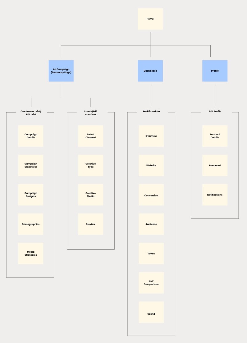
Kedet Sitemap
Iterate
Multiple iterations of quick sketching on paper highlighted the difficulty of maintaining essential tasks in a straightforward manner and at a uniform level. This exercise proved crucial in identifying flurent user flow.

Part of the Wireframes
UI
I started by defining the foundational elements, typography, color palette, spacing, and grid system, based on accessibility standards and brand alignment. From there, I developed a comprehensive set of components, including buttons, form fields, tables, charts, notification banners, and status indicators. Each component was designed to be flexible enough to adapt across both client-facing and internal views.
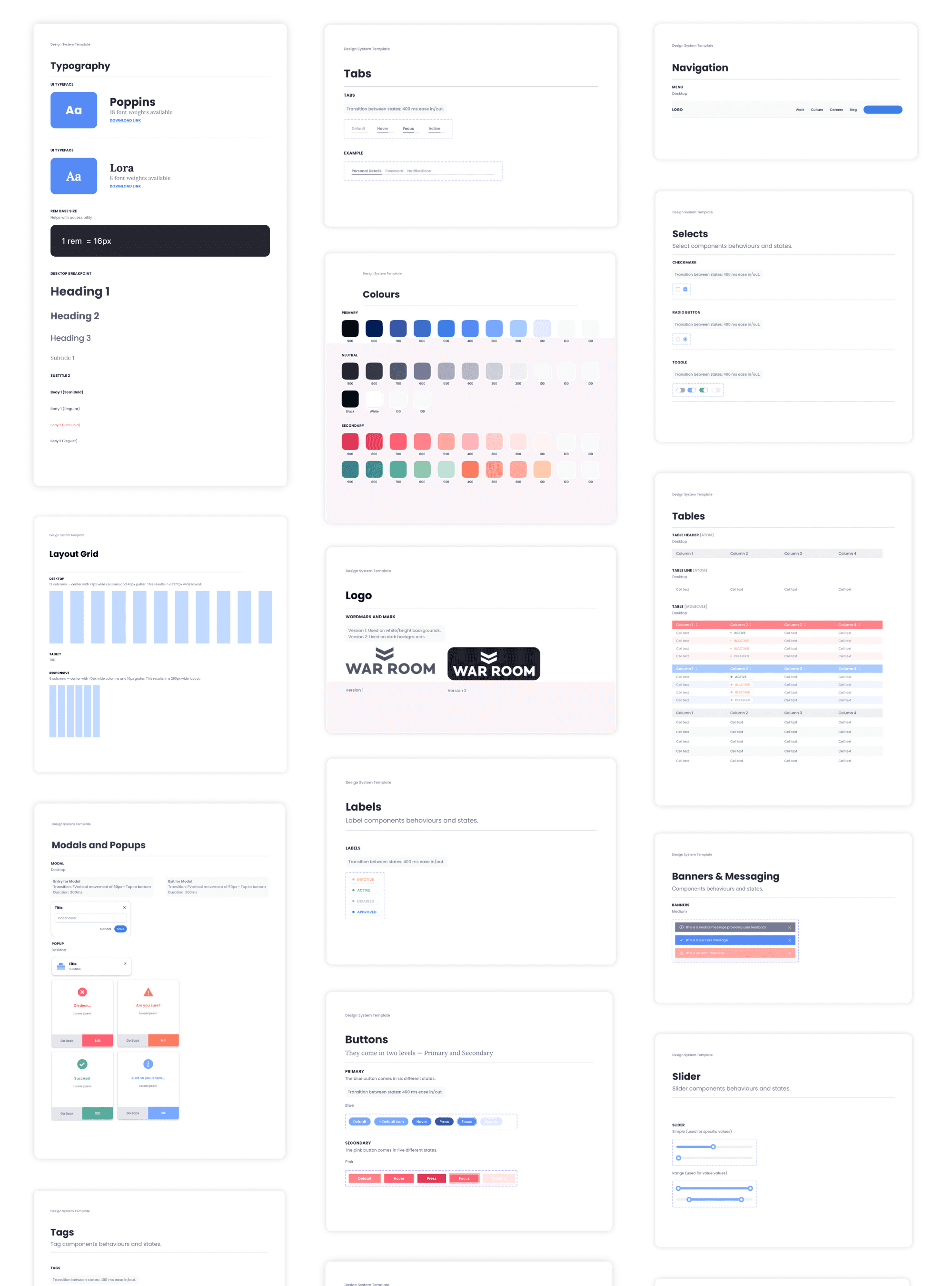
Design System og Kedet
UX
Once the app structure and design system were established, I moved into developing high-fidelity mockups that brought the Kedet App experience to life.
My focus was on ensuring clarity, usability, and alignment with real workflows across both client-facing and internal views. Each feature was designed with direct input from users and stakeholders, then iterated based on feedback to ensure we delivered intuitive, high-impact solutions.
Client Dashboard: Real-Time Ad Performance Tracking
In designing the client-facing dashboard, my goal was to deliver clarity and insight without overwhelming the user. I organized performance data into meaningful categories - Website Traffic, Conversions, Audience Engagement, Spend Trends, and YoY comparisons. Each module included visual charts, color-coded metrics, and filter options to allow clients to view performance across time ranges or campaigns.
I prioritized a modular layout with collapsible sections to support both high-level overviews and detailed exploration. This structure gave clients immediate visibility into what's working, what’s not, and where budget or targeting adjustments may be needed - empowering them to make data-driven decisions collaboratively with their account manager.
Notification Center for Live Updates
To reduce back-and-forth communication and improve client visibility, I designed a centralized notification center grouped by purpose: Mentions, Action Items, and Team Updates.
Mentions included direct communications or tag alerts from account managers, making it easy for clients to respond quickly.
Action Items highlighted tasks requiring client attention, such as creative approvals, asset uploads, or feedback requests.
Team Updates delivered key performance shifts, campaign launch confirmations, and general announcements.
Each category was visually distinct and organized chronologically within its section. This structure helped clients stay organized, improved response times, and reduced reliance on scattered email threads.
Campaign Summary: At-a-Glance Campaign Health
The campaign summary section was designed to give users a quick snapshot of all campaign statuses - Active, Paused, Completed, and Error. This high-level overview included each campaign’s date range, budget pacing, and status tags, helping both clients and internal teams stay aligned on progress.
To support prioritization, error campaigns were highlighted and surfaced with suggested actions. The interface was intentionally clean and filterable by campaign name, objective, or timeframe. By centralizing campaign health in one location, it became easier to manage performance across multiple campaigns and eliminate friction during reporting or troubleshooting.
Campaign Summary: Bulk Edit Functionality
One major piece of insights from campaign managers was the need to edit multiple campaigns at once, especially during seasonal or high-volume periods.
In response, I designed and implemented a bulk edit mode. This feature allowed users to select multiple campaigns and apply changes to attributes like budget, targeting, and creative elements in a single action. I worked closely with developers to ensure data integrity and added confirmation steps to prevent accidental edits. This drastically reduced repetitive manual work and made the platform more scalable for power users managing large ad portfolios.
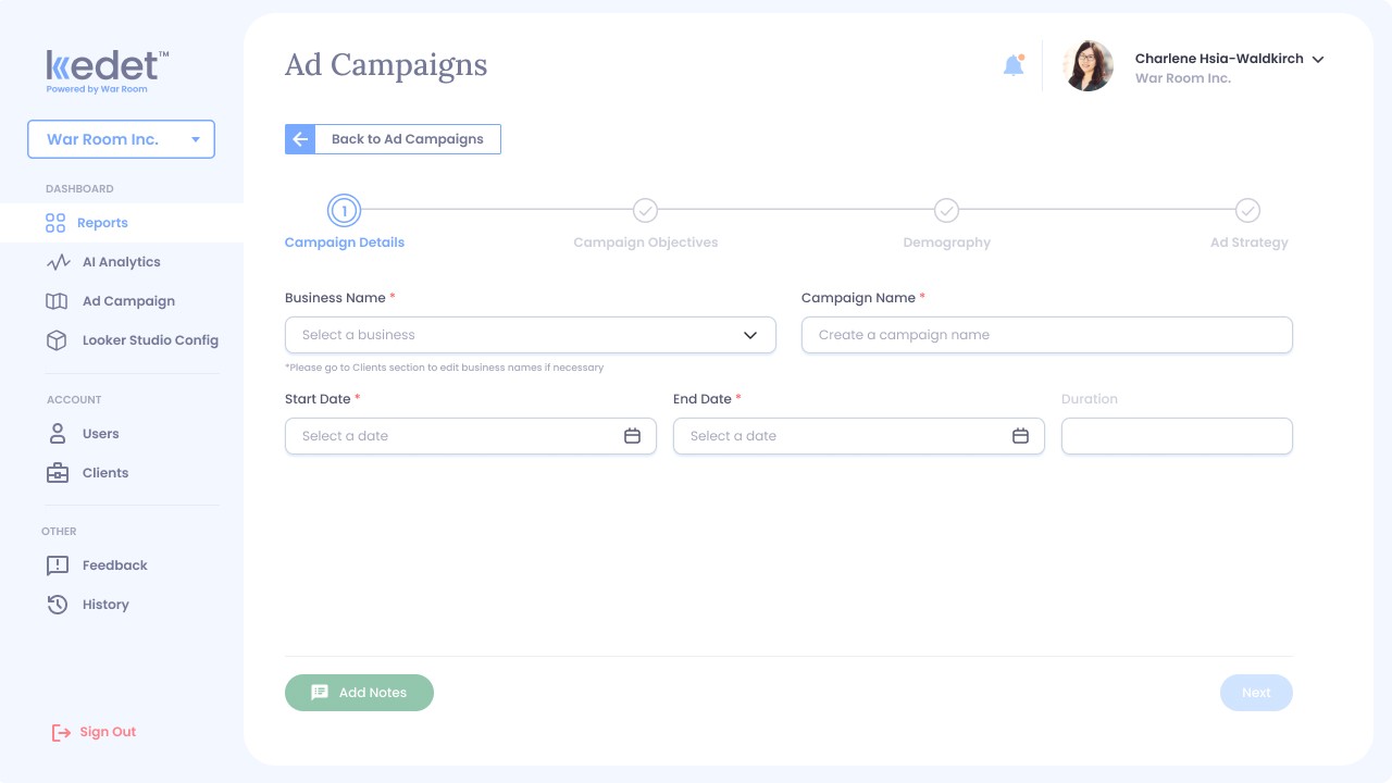
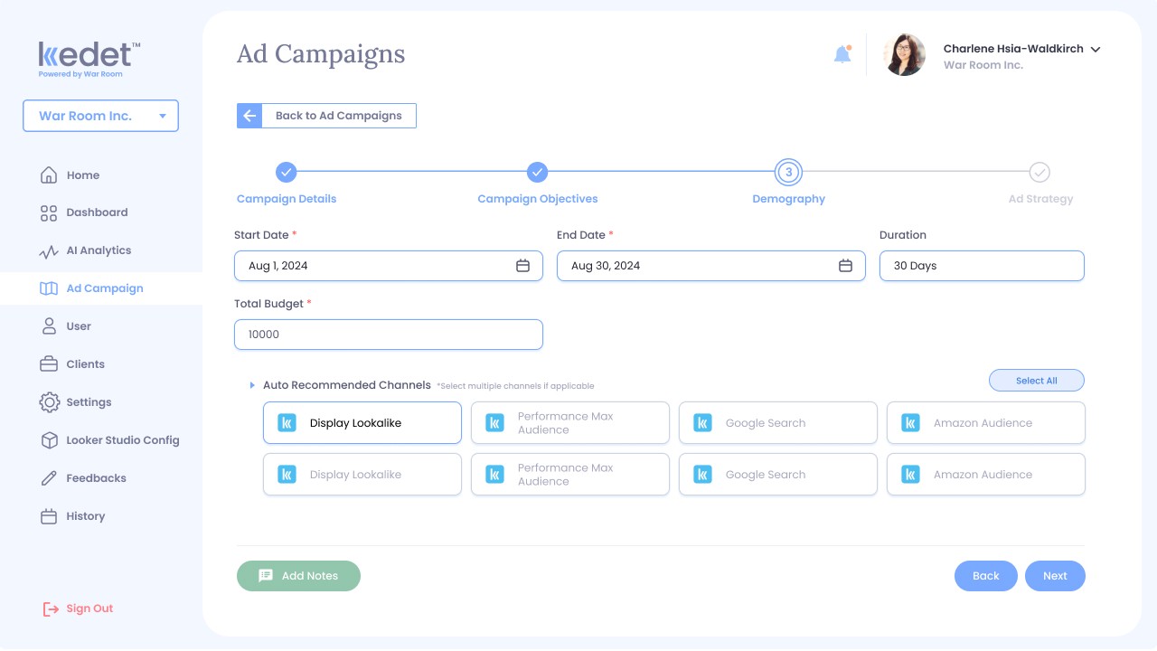
Create Campaign Workflow: Step-by-Step Guided Setup
To simplify the ad creation process, I designed a guided, multi-step workflow that walked users through campaign creation. The flow included sections for Campaign Name, Objectives (e.g., Traffic, Conversions), Target Demographics, Budget, and Ad Strategy. Each step was broken down into digestible fields with helpful tooltips, allowing users to progress with confidence, whether they were seasoned campaign managers or clients setting up their first ad.


Create Campaign Workflow: Integrated Generative AI Ad Copy Tool
To enhance productivity and creativity during campaign setup, I integrated War Room’s generative AI ad copy tool directly into the creation flow. This allowed users, especially campaign managers and clients, to input basic prompts or campaign goals and instantly generate ad headlines, descriptions, and CTAs.
Users could preview the generated copy within platform-specific ad templates (e.g., Meta, Google) and make edits before finalizing. This feature significantly reduced the time spent on copywriting and empowered teams to test variations faster. It also bridged the creative gap between strategy and execution, helping teams launch polished, high-converting ads with minimal delay.

Refine
Usability Testing
After the initial high-fidelity prototype was completed, I conducted usability testing sessions with both clients and internal users, including account managers and campaign managers. The goal was to validate key workflows, identify friction points, and gather feedback on navigation, clarity, and overall user experience. Participants were asked to complete common tasks such as reviewing campaign performance, creating a campaign, and managing campaign assets.
Key Findings
1 / Missing Workspace
Clients appreciated the clarity of the dashboard but wanted a way to jot down personal notes or follow-ups directly within the platform.
2 / Disconnected Communication
Account managers requested a streamlined way to reference past conversations or campaign-specific reminders during client check-ins.
3 / Low Visibility
Multiple users found the step-by-step campaign creation interface helpful, but the progress indicator was too subtle and lacked clarity on their current position within the workflow.
4 / Rigid Navigation
There was also a desire to revisit previous steps during setup without losing any entered information.
Refine
Post-Testing Improvements
Based on insights gathered from usability testing, I prioritized enhancements that would improve efficiency, communication, and overall clarity in key workflows. Two high-impact updates were implemented to address user feedback and elevate the overall experience.
Notes Feature for Clients and Account Managers
To enhance collaboration and reduce reliance on external note-taking tools, I introduced a notes section within each campaign. Clients and account managers could now add private notes or shared comments directly tied to a campaign. This supported real-time decision-making and helped both sides keep track of insights, questions, or changes discussed during meetings. Notes were auto-saved and timestamped, creating a light-touch record of campaign dialogue.
Step Progress Indicator Optimization
I redesigned the campaign creation progress bar to be more prominent, interactive, and informative. The new design featured labeled steps with clear markers showing the current stage, steps completed, and steps remaining. Users could now click to jump between steps, with autosave functionality ensuring no data was lost in the process. This improvement gave users more control and flexibility, especially during collaborative or non-linear workflows.

Keep growing
Key Takeaways
Reflections on Building for Clarity, Collaboration, and Impact
Designing the Kedet App was an end-to-end experience that pushed me to think holistically, balancing business goals, user needs, and operational realities. I learned how vital it is to design not just for the user interface, but for cross-team workflows and communication systems that support real-world complexity.
Working closely with stakeholders across departments helped me better understand how to build scalable structures that serve both internal and external users. Continuous testing and feedback loops ensured that design decisions were grounded in real behavior, not assumptions.
Most importantly, I saw the value of designing for clarity, whether it was in dashboards, workflows, or collaboration tools. Simplicity, when executed well, can drive adoption, trust, and long-term impact.
Next Project

Millie Chan